Final Project

Final Project:

VR-Final Project

Artist Statement:

“Coventry, Connecticut” is a map intended to encourage local Connecticut residents to travel to Coventry and interact with local businesses and attractions. The audience is New England families who have an interest in farm-life. This map encourages tourism by highlighting the key attractions of the town, such as the farmer’s market and restaurants. The featured locations were chosen as they are the most frequently visited attractions that may interest tourists while simultaneously bringing business to Coventry. They are represented with hand drawn/colored symbols. This style echos the home-grown, family friendly atmosphere of the town. The only writing on the map, outside of the established town logo, is also handwritten or it a handwritten looking font, further encouraging the family oriented atmosphere.  Only the main roads along which these attractions can be found are highlighted to simplify the map and emphasize the features of Coventry that the audience can interact with.The design uses a friendly collection of colors that are associated with spring such as light greens and pale blues. The negative space is filled with bright yellow daffodils and sunflowers that are associated with farms and nature. This adds a brightness to the map and also parallels some of the surrounding photographs. The cows are added to the negative space as well to encourage the idea that Coventry is a farm town and the audience will be able to interact with the local farms. The photographs that line the perimeter of the map add a key element of rhetorical influence as the viewer is then able to picture themselves exploring all the sights and attractions first hand. Happy people and kids are scattered throughout the design to encourage the truncated syllogism that visiting Coventry will make the audience and their families happy.

Map

Blog Post 4//12.12.2017

Revisions

After our class meeting and a subsequent meeting with Professor DeWinter, Katie and I had a lot of specific feedback to improve our draft. We changed the colors from feminine breakfast/brunch to the dark muddled greens and browns more likened to hangovers. This is further encouraged by the sepia brown background. The symbols were changed to varying shades of blue to represent the relief that the restaurants would provide to our hungover audience.  We also employed a 1960’s diner feel by choosing a neon sign like font and displaying pictures from the different restaurants as a diner does on their place mats.  We then differentiated between sit-down meals and quick stops as this seemed like useful information our audience would be interested in as well as the amount of time it would take for someone to ride a bike to the different restaurants. Additionally, we included the logos for the different restaurants instead of simply titling them so that the viewer would know what to expect when looking for the store fronts. These are repeated again in the images on the side to provide unity and make a quick and helpful key for the hungover viewer.  We also filled the negative space with empty haphazard beer bottles and a 1950s inspired comic to perpetuate the humor of the theme throughout the entirety of the map.

Final Draft

Hangover Map- FD

Artist Statement

“The Hangover Map” is a map intended to encourage an audience of WPI students to use the Gompei’s Gears bike program to explore breakfast restaurants near campus. The purpose of the project as a whole was to create a map that reimagines space. While we did decide to maintain a road perspective, the idea of using bikes, rather than cars, as a means of traveling from point A to point B redesigned the area around WPI. Our audience is WPI students who live on or near campus who do not have access to a car and yet are still interested in exploring the local area. We modeled our map after a 60s diner theme, reflected through our font choices and well as the border of pictures that surrounds our map. Our title and subtitle both use a 60s, neon sign font while our legend and picture captions use a diner menu style font. These fonts encourage our overall theme and unity of the map. We also use symbols as icons throughout our map to show the pricing of each breakfast location. A coffee cup represents locations that were “Grab N Go”s, since grabbing a coffee is often thought of as something quick and energizing. An octagon with a superimposed fork and knife is used for sit down breakfast spots. The octagon symbolizes that this location is somewhere the reader will need to stop at, with the fork and knife further emphasizing that the meal is not a quick fix as a coffee is. The background color choices of sepia and dark green reflect the muddled, groggy feeling of a hangover. This is then juxtaposed with the clean refreshing blue tones that outline each restaurant to show them as a beacon of hope to our hungover audience. The tones of the icons representing food gets closer to a clear blue as the meal prices become less expensive. This is because our audience, following the cliche of broke college students, are most interested in getting the most satisfying meal for their needs for the cheapest price. We utilize humor throughout the design by inclusion of beer bottles and a 1950 esque cartoon in the corner. This is intended to make the audience feel comfortable and trusting of our breakfast recommendations.

Revising the Infographic

Blog Post 1// 12.11.17

Revisions:

To be completely honest, I was on the fence about revising this project. It was probably my least favorite unit that we covered in Visual Rhetoric. However, with the suggestions Professor DeWinter made to improve it, it seemed impossible to resist.

Here is the original:

Final Draft-infographic

Here is the revised:

VR-infographic-final-final

DeWinter had suggested removing the green background to make things pop. I made this small change and instantly saw a huge difference. The titles of each component of the goat’s anatomy no longer seemed awkward and the components themselves were able to shine. DeWinter also suggested to line the titles up with the subordinated text which was a simple change to make that really cleaned up the image.

Professor DeWinter also recommended adding a charming and heartfelt alumni story to enhance the rhetorical ability of the info graphic to target the “aspirational ethos” and diversify the info-graphic further.  However, this was a change that I struggled to find a way to integrate into the info-graphic due to the limitation of space. Therefore, I partnered it with her last piece of revisionary advice. She said that the Breathe Easy got a little lost as it was different than the other blurbs. Taking this into consideration, I altered the blurb so it seemed as though an under represented woman (featured on the WPI bio/biotech webpage) was saying it. This encourages the idea that our audience has the support of people just like them for all their questions and concerns which significantly increases their comfort level and personalizes the entire experience. This change highlights the differentness of the information presented in the blurb and celebrates it rather than attempting to hide in plain sight as it was doing before.

After making the changes Professor DeWinter had suggested that brilliantly improved the info-graphic in subtle yet clever ways, I made a few additional changes to maintain some of the points of emphasis that had gotten lost in the changes. For example, by making the background white, some parts  of the info-graphic became lack luster. I decided to increase the width of the circles and lines of the call out to draw more emphasis to the call out itself and the goat. Also,the titles got lost in the other blurbs of text because they no longer had the boxes around them. Therefore, I bolded them so that when the audience would by chance glance at the info-graphic, those charming titles would stand out and entice them to read the longer blurbs.

Overall, the changes that were made were subtle yet effective in enhancing the best parts of the info-graphic and removing some of its largest faults.

Revised Artist Statement:

“The Anatomy of the Biology & Biotechnology Major at WPI” is an infographic intended to entice an audience of underrepresented, female prospective students to join the biology and biotechnology major at WPI. The purpose of this project, as a whole, is to create a persuasive infographic with an effective, eye-catching message. To do this successfully, we first established our audience to be underrepresented, female prospective students currently in high school with a potential interest in majoring in biology/biotechnology at WPI. The infographic itself is intentionally designed to inspire our audience to pursue that potential interest by displaying relevant factual data as well as evoking an emotional response, making them feel welcomed and like they belong. We found it most effective to convey this idea using a biological call out of a Victorian looking goat, creating an instant association with the respected biology field, on which we purposefully highlighted six parts of the goat’s body to emphasize what majoring in this field entails for someone during and after her college experience. Each audience member is able to see herself attending WPI and studying biology/biotechnology as she sees herself represented in the statistics and in the included photographs of women that are engaging in biology-related activities,walking a goat, and providing the information about additional resources specific to WPI. She sees the potential to prosper through engaging qualitative research stories and job placement statistics. Further, all of these components are unified with a pastel color palette and a thin font, as these design features are thought to be more appealing to females and prevalent on biology diagrams.

Final Project

Blog Post 1// 12.10.17

Another post so soon you ask? Well I think I have finally found my favorite topic in Visual Rhetoric-maps. For our final project for this class we were given a choice of revising a past project or creating a new project. At the moment, I don’t feel that I have enough ideas on how to improve any of my past projects . This might change over the next few days. However, for the time being, I decided to try something new.

I have found my passion in maps. I am really fascinated by the conditional rhetoric they hold and how we have preconceived notions of what should be included on a map and what should not. Therefore, I began my brainstorming by thinking about what map I’ve felt a need for in my life.

My first instinct was a map of Price Chopper that details where items are within the store. This is because when I am not at WPI  I am a cashier at a Price Chopper and I still feel lost whenever someone asks me where anything is . I then felt inspired by the Cape Cod tourist map I featured in my first post of my Map unit. I love how they use icons and completely ignore roads. It presents key features in the relative area of space using established characters and icons. It is almost a balance between a comic and a map. Therefore, I began trying to execute this idea in Power point by creating a general outline of the store and putting cartoon icons in the viscintiy in which various items would be located. However, I didn’t like the way this looked and figured that this would not be a useful map for anyone besides myself. Therefore, I scratched that idea and started over.

Price Chopper Rough Draft

VR-pricechopper-RD1

Already thinking about my home away from Worcester, my next idea came quickly( they do say your creative inspiration comes from what you know best). I though what if I create a tourist map for my own small-town back home.  I live in a town called Coventry, Connecticut. It is a farm town with notable features including one of the largest weekly farmers markets in the state, a lake, a library, and a few local businesses. Recently, the town has been refurbishing sidewalks and other public works projects to bring more business into town and make it more desirable. Therefore, the town would benefit from  a tourist map highlighting the key features of the town with the purpose of enticing people from outside of the town to come to Coventry. The audience is non-residents who are interested in farm life and small town features, most likely adults with children.

Taking this idea and running with it, I began in PowerPoint by outlining the town limits of Coventry and the lake and making them their own shapes in PowerPoint. Then, I identified the key features in my town that would interest my intended audience.  Next, I drew icons representing each feature. For example, the library was a stack of books, the farmers market was a basket of produce and the red barn where it takes place, the lake had a sail boat and the local tavern had a burger. I decided to hand draw and color them with colored pencils to maintain a “home-grown” farm feel to the map that would attract my intended audience.  This keeps the colors dull and lack-luster but still warm and friendly. It subconsciously tells the viewer that this is a family-friendly town.

At this point, I like this idea but my actual design seems very simple and not very professional. I am also concerned my classmate won’t understand what I am trying to communicate because they have most likely never been to my home-town or the areas around it. I look forward to feedback on whether or not this is even an idea worth pursuing for this class.

Coventry,CT rough draft

Ctown-map-RD-1

Map

Blog Post 3// 12.09.17

Rough Draft 2

I know what you’re thinking…another blog post…another rough draft…already?! However, a lot can change in a day or two. After posting our first draft, Katie added images of different meals that some of the restaurants showcases(all images were taken from the different restaurant’s online menu). We thought this was crucial to include as it offers a sense of the different style of  some of the breakfast places located around WPI which is an obvious and natural inquiry most of our audience would have when considering where to eat breakfast. It also attracts the average WPI student that we hope our audience will be composed of ,to want to look at our map because these pictures by themselves,are attractive and their sole purpose is to entice hungry-breakfast loving people.

Additionally, on my last post I got an incredibly helpful comment from our fellow classmate Henry. He outlined specific aesthetic issues that to an outsider seemed a bit “jarring”.  This was a very helpful perspective as he was able to see the things that made our map feel a little bit off that Katie and I could no longer see because we were too involved. We were then able to take a step back and look at the big picture that we had lost sight of.

We centered the main image and lined it up on the blurred background to make a more seamless transition.  We increased the sizes of everything from the coffee cups to the lines representing the bike paths. This makes everything easier to see and for the important things to stand out  if our audience were merely glancing at a map for five seconds, a concept discussed in the comic unit.  The size increase also spreads out the information more evenly so it is not crowded all on the top. We also switched the meaning of the blue and red tone coffee cup because, as Henry pointed out, our audience would expect that red should indicate caution/stop/stop signs and that would be more naturally associated with the higher prices.

We hope that the changes we made emphasizes our purpose of enticing WPI students to explore local breakfast establishments.  We also get back to the root of our intentions of reimagining space to a non-driving student’s perspective rather than the traditional road based approach.

Our second draft is shown below

Map-RD-2

Some feedback we will be looking for in class and on our blogs is any suggestions on a  way to connect the images to the locations where they are from without using call out boxes (similar to those my group used in the info-graphic assignment). We feel the way it is currently done shows too many lines being crossed and is not as attractive or effective as it could be.

Map

Blog Post 2// 12.08.17

The Design Proccess

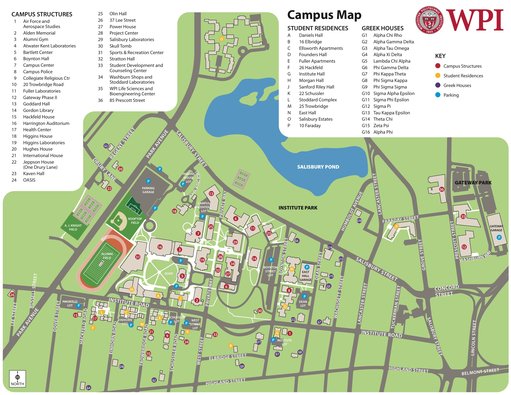
When Katie and I met to share ideas it seemed like we were on the same page. Our first instinct was to create a map detailing restaurants/activities around campus that WPI students could easily access. We saw the need for this as one of Katie’s most frequently asked questions as a tour guide is “what is there fun to do around here.” There are some resources that the admissions office offers and are handed out at New Student Orientation. However, they are all mere lists and give no sense to how far away any of these places actually are. Therefore, we saw a need for a spatial representation of this information.

We realized we wanted to narrow down our topic and therefore chose to map breakfast places within walking/biking distance of WPI. I personally feel the need for a map like this because I know most of my friends and I, if we go out to eat, get breakfast because it is cheaper than other meals and usually gives you the most bang for your buck. Also, throughout most of the year neither me or my friends have access to a car and therefore, our options feel limited as everything has to be within walking/biking distance. I constantly find myself googling “breakfast places near me.”  I would personally find use for a map like the one Katie and I are proposing. Therefore, our audience is WPI students who live on campus or right off campus who do not have access to a car and our purpose is to encourage them to bike to and dine at local breakfast hubs.

We also looked at the assignment and wanted to think of a way to reimagine the space. We decided to do that through instead of using the roads (while they may be reference points and are on our background image) we would direct students along walking/ biking paths to get to the restraints we would highlight. We chose biking because of the Gompei’s Gears program at WPI where any student can borrow a bike. Therefore, we know all students have access to one and it is most likely more realistic for students to be willing to bike a mile to a restaurant than walk the mile, expanding the radius of our map.

Other information we wanted to include on our map besides spatial information was the relative costs of each breakfast place as that is often a top consideration of college students on a budget.

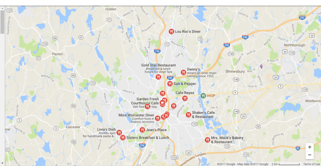
We began by looking at the sources I compiled in my previous post along with additional maps found through googling and started realizing what we wanted to do. We were seeing that the idea of pinning things to different locations on the map was a common and understood trend. On maps such as those provided by google and by other search engines when you search “breakfast places near me”, there would be a road map of the area around WPI on which the breakfast spots would be marked with a pin icon. When you interacted with a specific pin it would pull up information such as specific location, pictures of the food and the price represented by a $$$,$$ or $.

In designing our own map we began with compiling a list of spots someone could get breakfast within two miles of WPI. We then looked at the prices relative to each other and divided them into three categories of most expensive, middle expensive and least expensive.

We began our actual design with choosing the background to be a road map of the area around WPI provided by a Bing search. The colors were naturally pastel with the major highway being a light purple, parks being a light green and ponds being a light blue. We thought this would be familiar to most of our audience and easily recognizable. On top of that we placed pin icons for each of the breakfast spots and labeled them. We then communicated the relative price by using different color coffee mugs in which the color was assigned value by a key in the corner. We chose coffee mug icons because that is a recognized symbol for breakfast and communicates the theme of our map effectively. The colors for the mugs are variant shades of pink/purple. This is the color combination that best stood out yet complimented the background image. We were slightly concerned these color choices would give our map a feminine feel. However, we hope to counteract that with a bolder font choice. Also, we didn’t necessarily think it was a bad thing to target more of a female audience as going out to breakfast does tend to be marked as a feminine activity.

Finally, we symbolized the center of campus with the bike icon found on the Gompei’s Gears logo and outlined bike paths to each of these restaurants in the WPI red. This creates a natural association to WPI that specifically targets our audience and makes them feel comfortable.

First Draft

Below is a copy of our first draft after our first group meeting. We are planning to meet on Sunday as well, so hopefully some more improvements will be made so we can get the most accurate and helpful feedback on Monday.

The HangOver Map-1

Map

Blog Post 1//12.07.17

Background

  • Kimball, Miles A. “London Through Rose-Colored Graphics: Visual Rhetoric and Information Graphic Design in Charles Booth’s Maps of London Poverty.” in J. Technical Writing and Communication. (2006) Vol. 36(4) pp. 353-381.
  • Kitchin, Rob; and Martin Dodge. “Rethinking Maps” in Progress in Human Geography. 31 (3) (2007) pp. 331-344.


Our next assignment is all about maps. I never really considered that maps could be trying to persuade the user. I always thought they were as objective as a calculator. They seemed like mere tools that you used when you were lost or unsure where to go. However, after our discussion, I realized that couldn’t be farther from the truth. Maps are controlled by the subtle but the most powerful form of rhetoric, conditional. This is the rhetoric motivated by ideology.  After reading the sources above, it became clear that things such as color and the way you use a map and interact with it are motivated by the intrinsic values we have and your personal identity. Therefore, moving forward in this assignment we will have to address the ideology of our audience and chose how and what we focus on very carefully in order to achieve our purpose.

The Assignment

“You need to work on maps of Worcester with some purpose and audience in mind. Get me to think about space differently. You can be as radical as you want to be. Do not feel limited by previous ideological representations if it acts against your purpose.”

-Proffessor DeWinter

Initial Thoughts and Research

I will be working on this project with Katie. After an initial discussion, we thought we would create a map that shows different type of food options near WPI to target WPI students to eat out in restaurants around campus.  We thought we could superimpose color-coded icons to maybe represent cost or ratings onto an existing map of Worcester. However, this is only an initial idea and we may change this plan drastically after our first group meeting tonight.

Ideology is inherently hidden but present in everything we do. Therefore, I think this project will be very difficult to complete successfully. There will probably be a lot of things that we think naturally have to happen in every map, like following roads, that only is a misconception of ours because our own ideologies expect some designs over others. We will need to find a balance between new ideas and what is expected of our maps in order to keep the audience comfortable but also thinking about space differently.

Therefore, in brainstorming  how to get out of the box I began looking at current existing  maps that may show existing trends and/or unique ideas Katie and I could incorporate into our own draft.

WPI campus map

  • Reference. “Campus Map.” Worcester Polytechnic Institute. n.d.Accessed 12/07/2017 via http://www.mobilemaplets.com/showplace/3430

This map is the WPI campus map that WPI gives its students at New Student Orientation. It highlights roads and buildings as well as green space. It is intended to help new students familiarize themselves with campus.

Breakfast places near me

This is the google generated map when you type it “breakfast places near me.”  It focuses on the roads, natural markers such as ponds and parks. Then, the restaurants themselves are represented by simple round red symbols, almost like a stop sign.  It is intended to provide their audience with specific ideas and distinct directions by road on how to get there.

friedClamsCapeCod

This map depends even more on symbols to represent the locations of different notable things across a big area. It creates a cartoon feel and focuses on providing interest over specific directions or information. It is intended to attract tourists to a theme of attractions.

Overall, these maps offer alot of different options for how we could present our ideas. It also shows how much the purpose and audience will effect the best way to present these information. I can’t wait to share with you what Katie and I come up with!

Comic

Blog Post 4//12.06.17

Feedback

After class on Friday, Henry and I got some very helpful feedback! Most of the comments we received were on the layout of each of our slides. To improve this, we reorganized. Specifically, we switched the placement of the American and Chinese slides. We feel this also improves our appeal to ethos as more students may relate to an American theme than a Chinese theme. This is because most WPI students are from America and most likely grew up learning Humanities with an American focus whereas Chinese might be viewed as something more adventurous and new to take, making it a great second example to compliment the first. Also, in order to clean up our characters, we vectorized them in Adobe Illustrator. This also made them a unified color which helps with the overall unity of our slides and so that they are not clashing with the grey informational box on some of the slides.

Final Draft

Comic-FD-1Comic-FD-2Comic-FD-3Comic-FD-4Comic-FD-5Comic-FD-6Comic-FD-WC

Artist Statement

Our instructional comic, “Humanities and Arts: The Thematic Approach,” explains how students can take the thematic approach to complete the Humanities and Arts requirement at Worcester Polytechnic Institute, and why they should consider it. It is specifically intended for the students who have the greatest need for this information: freshmen at WPI who do not like the restrictions of the conventional breadth and depth approach. The comic begins by giving viewers a taste of the varied possibilities of the thematic approach and some examples of relevant classes, then describes the actual process of choosing courses through a simple, easy-to-follow infographic. The comic works to achieve ethos with WPI students through several means. The settings of the WPI campus and the Worcester Art Museum are ones with which they are both familiar and comfortable, and our use of actual photographs makes them more immediately recognizable. The audience is directly guided along the journey of discovering this approach to the Humanities and Arts requirement by a cast of characters representing the major disciplines of humanities. These characters speak directly to the viewer in a cheerful tone, engaging and sympathising with them. Furthermore, the variety of color and style throughout the comic serves to both entice the audience by providing visual interest and to emphasize significant details. This was a trend we continued in the text, where key words were bolded and colored red. The combination of these elements throughout the comic is used to make the thematic approach appear less daunting and confusing.

Samples

We also wanted to include some examples of how the comic could be used, which can be found below.

Comic

Blog Post 3// 12.03.17

Rough Draft #2

After class on Thursday, we got some very helpful tips from Professor DeWinter on how to improve our comic. Some key design changes included outlining our characters in thick lines as our text and other boxes are in order to give them a more clean and put together look. We also needed to rearrange some of our slides, especially the first one in order to improve readability and flow. We did this by decluttering the word bubbles where possible and stacking different frames on top of one another to encourage the veiwer’s eye in the intended direction

Professor DeWinter also mentioned some key content changes that could help better explain the information we were presenting. This resulted in us adding grey boxes on the slides that explained examples of the Thematic Approach that include possible courses a student could take. These unify these types of slides and create an association almost to a text book where the definition may be found in the margin that you could ignore or you could choose to focus on if you were interested. This speaks to our audience as they are typically individuals who would be used to reading blurbs in that textbook definition method. This is, therefore, a familiar and effective method to present the extra, specific information that makes our comic more relevant to what the audience may actually see when trying to plan out a Thematic Approach to their Humanities and Arts requirement.

We also found that our slide explaining how to actually do the thematic approach was overtly confusing and therefore, we simplified the information into a concise informational graphic. This is a visually interesting way to display the information and proves to be easier to follow and more concise than having an array of characters try to explain it.

The content of some of the text bubbles was also changed in a few different places to either better explain an idea or elaborate.

Overall, we made a lot of little changes that ultimately make a very large difference in how readable our comic is. We look forward to hearing more feedback from the class tomorrow to further improve our info-graphic.

Note:The images used in this version of the comic are the same as before and are cited on previous blog post 2 of comic.

VR-Comic-RD2-1VR-Comic-RD2-2VR-Comic-RD2-3VR-Comic-RD2-4VR-Comic-RD2-5VR-Comic-RD2-6

Comic

Blog Post 2//11.30.17

Rough Draft #1

Comic-D1-1Comic-D1-2Comic-D1-3Comic-D1-4Comic-D1-5Comic-D1-6

Comic-D1-7

The Design Process

We used Powerpoint to make the pages shown above. We began with a script we carefully crafted that was playful yet informative to appeal to our young Freshman WPI audience. Some specific jokes are targeted towards this age group, such as the one about the professors in slide 3. The script is directed directly at the viewer as the main characters are consistently breaking the third wall and referring to the viewer as if they are directing a tour for the viewer.

Henry then put all of the text into the speech bubbles to make them appear as dialog. I then went through and entered the background images of the Worcester Art Museum as well as our characters. Originally, we were thinking to make the background images the whole background but it seemed best to guide the flow by breaking it up with solid color boxes in a light shade. By designing the slide that way we had more control over how the viewer may read the slide. However, we kept in mind that our audience in Western reading and would naturally read left to right top to bottom, and therefore attempted to keep the flow along those directions.

The characters are a collection of ones I’ve hand drawn and copied into the comic and a few taken from the internet. The hand drawn ones are each representing a different aspect of the disciplines in Humanities and Arts. For example, a piano represents music and the paint brush and painting represent art. This is intended to show the unification of the disciplines under the theme as they are all coming together to act as experts and explain what this method for creating the requirement is and how it can be done. The leader figure, the book, was chosen to guide the story because having a central figure helps unify the story line and the book is often the epitome of Humanities and Arts and is found in most disciplines. The additional characters such as the cityscape, the festival Chinese dragon and George Washington were taken from the internet and edited to fit our comic as characters specific to each theme. They were chosen to not be drawn to highlight the difference between the discipline characters and the thematic characters and provide emphasis to the discipline characters. All pictures taken from the internet are cited in the work cited page.

We then worked on arrangement on each page of our comic to provide flow when reading the comic. This proved to be difficult as there are so many speech bubbles to continue our plot that sometimes the background image/characters are lost and it seems overwhelming.

Things we like:

  • The color that the Worcester Art Museum/block background provides
  • The use of white space to provide emphasis to the color.
  • The third wall breaking script
  • The comic “feel” of having the boxes and speech bubbles outlined with thick black lines

Things we may want to change:

  • It is currently 6 pages but the limit is 4-5
  • The flow is somewhat hard to follow when there is a lot of text
  • Dependence on words
  • Organization of each page
  • Unprofessional appearance of hand drawn characters