Blog Post 1//12.07.17
Background
- Kimball, Miles A. “London Through Rose-Colored Graphics: Visual Rhetoric and Information Graphic Design in Charles Booth’s Maps of London Poverty.” in J. Technical Writing and Communication. (2006) Vol. 36(4) pp. 353-381.
- Kitchin, Rob; and Martin Dodge. “Rethinking Maps” in Progress in Human Geography. 31 (3) (2007) pp. 331-344.
Our next assignment is all about maps. I never really considered that maps could be trying to persuade the user. I always thought they were as objective as a calculator. They seemed like mere tools that you used when you were lost or unsure where to go. However, after our discussion, I realized that couldn’t be farther from the truth. Maps are controlled by the subtle but the most powerful form of rhetoric, conditional. This is the rhetoric motivated by ideology. After reading the sources above, it became clear that things such as color and the way you use a map and interact with it are motivated by the intrinsic values we have and your personal identity. Therefore, moving forward in this assignment we will have to address the ideology of our audience and chose how and what we focus on very carefully in order to achieve our purpose.
The Assignment
“You need to work on maps of Worcester with some purpose and audience in mind. Get me to think about space differently. You can be as radical as you want to be. Do not feel limited by previous ideological representations if it acts against your purpose.”
-Proffessor DeWinter
Initial Thoughts and Research
I will be working on this project with Katie. After an initial discussion, we thought we would create a map that shows different type of food options near WPI to target WPI students to eat out in restaurants around campus. We thought we could superimpose color-coded icons to maybe represent cost or ratings onto an existing map of Worcester. However, this is only an initial idea and we may change this plan drastically after our first group meeting tonight.
Ideology is inherently hidden but present in everything we do. Therefore, I think this project will be very difficult to complete successfully. There will probably be a lot of things that we think naturally have to happen in every map, like following roads, that only is a misconception of ours because our own ideologies expect some designs over others. We will need to find a balance between new ideas and what is expected of our maps in order to keep the audience comfortable but also thinking about space differently.
Therefore, in brainstorming how to get out of the box I began looking at current existing maps that may show existing trends and/or unique ideas Katie and I could incorporate into our own draft.
- Reference. “Campus Map.” Worcester Polytechnic Institute. n.d.Accessed 12/07/2017 via http://www.mobilemaplets.com/showplace/3430
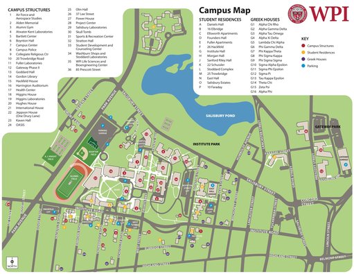
This map is the WPI campus map that WPI gives its students at New Student Orientation. It highlights roads and buildings as well as green space. It is intended to help new students familiarize themselves with campus.
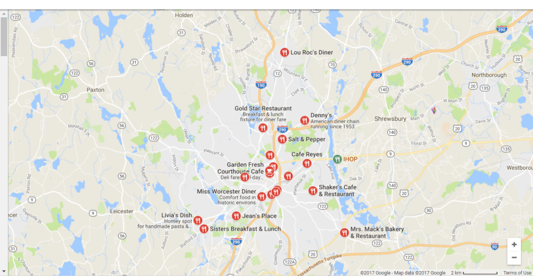
This is the google generated map when you type it “breakfast places near me.” It focuses on the roads, natural markers such as ponds and parks. Then, the restaurants themselves are represented by simple round red symbols, almost like a stop sign. It is intended to provide their audience with specific ideas and distinct directions by road on how to get there.
- Reference: Wallace, Tim. “The Cape as Fried Clam Country.”Bostonography. Jan 06 2011 Accessed 12/07/17 via http://bostonography.com/2011/cartographic-greetings-from-boston/friedclamscapecod/
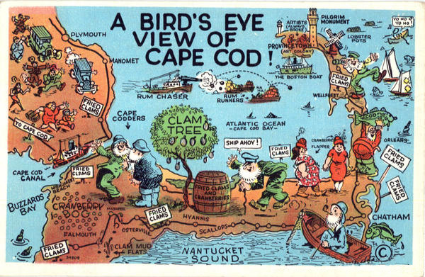
This map depends even more on symbols to represent the locations of different notable things across a big area. It creates a cartoon feel and focuses on providing interest over specific directions or information. It is intended to attract tourists to a theme of attractions.
Overall, these maps offer alot of different options for how we could present our ideas. It also shows how much the purpose and audience will effect the best way to present these information. I can’t wait to share with you what Katie and I come up with!

I think it’s so awesome that you’re making a map of places to eat around campus! That would be so useful to have!
I also like seeing your thought process, and the different places that you draw inspiration from. In addition to including information on costs and ratings, have you thought about including information catering to food allergies? As someone who can’t eat gluten or dairy, it’s so difficult to find places to eat out with friends. I look forward to seeing what you guys come up with! Great start!
LikeLike
I agree that information on a restaurants ability to cater to food allergies would be very helpful information. My only concern is our map becoming overcrowded or overwhelmed with information. Sometimes, its easiest to look at a simple map that has specific information. rather than one that has all the information you could possibly want. I think map making is a delicate balance between providing a decent amount of information and also having it being presented simple and efficiently as possible so that the map is quickly readable. While I love the idea of having the food allergy information available, I’m afraid it might be too much when our the majority of our audience is looking only for cost and convenience and doesn’t have to worry about food allergies. However, we will defiantly keep that suggestion in mind for future edits we make to later drafts if we feel we could provide more information without overbearing the audience.
LikeLike
I’m reading your blog posts after seeing your first draft, so it’s really interesting to see your thought process in creating this map. Your post is very thorough, you talking through your choice of viewpoint and choice of colors especially! I also like how you included bike paths – I think biking is underutilized at WPI, and it’s a great way to get around! Maybe you could include something to indicate if paths are more walkable or bikable,so students know what the options are. I know that with maps I often get confused about the time it takes to get from point A to point B because I am not used to map scales. That being said, your map is really really solid and you have some really great ideas going forward!
LikeLike
Thanks for the positive comments! We really liked the approach of using bikes because most people at WPI really don’t consider them so we can get our audience to re imagine the space. I think it would be difficult to incorporate your suggestions, as neat as it would be, because the bike paths still follow roads. Therefore, while it may be useful information on if they could walk the route too, it is really up to what our audience would be comfortable with which is a pretty personal choice. A way we could have possibly done this is sidewalks? However, because we are in Worcester most roads, even the side ones contain sidewalks which would not be helpful to delineate. Also, we thought people would be more likely to want to use these alternative methods if the time seemed short, so saying 5 min by bike sounds a lot more attractive than 25 min walking.
LikeLike